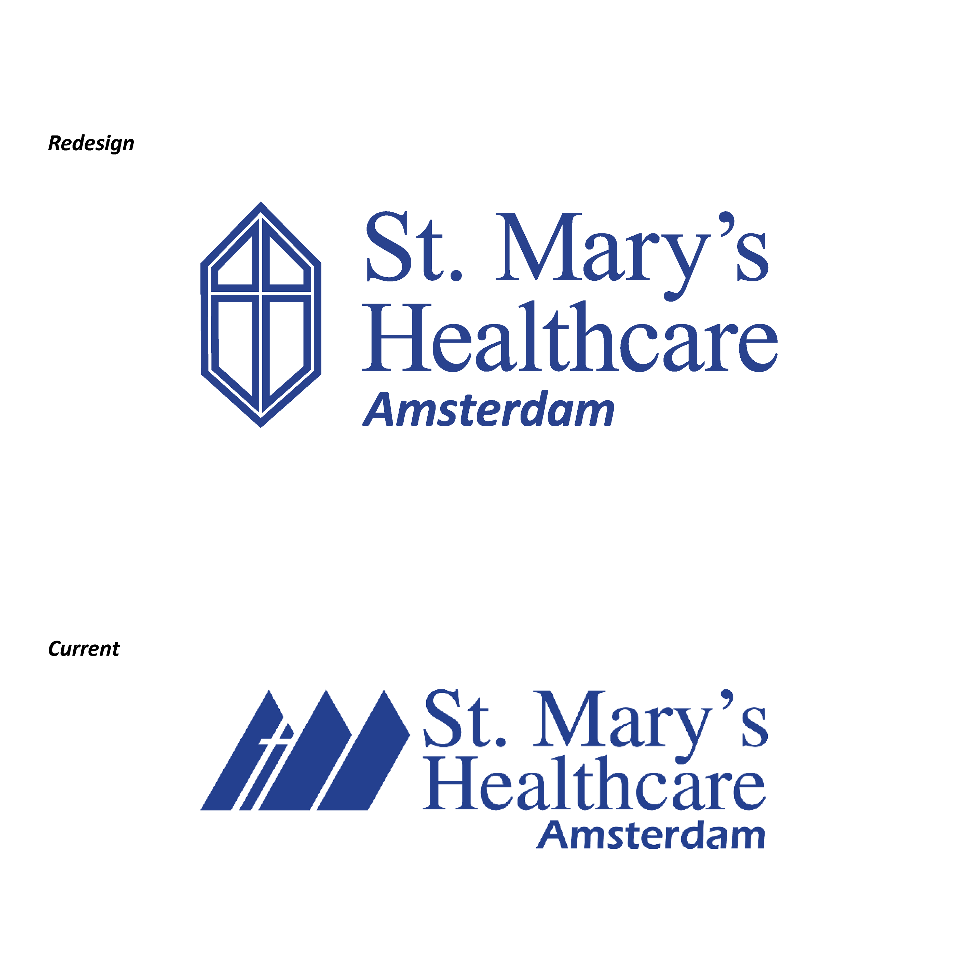
A random design prompt I was given said “redesign the logo for the company you currently work for”. I work at St. Mary’s Healthcare, a catholic hospital located in upstate New York with many clinics and urgent care sites around the region.
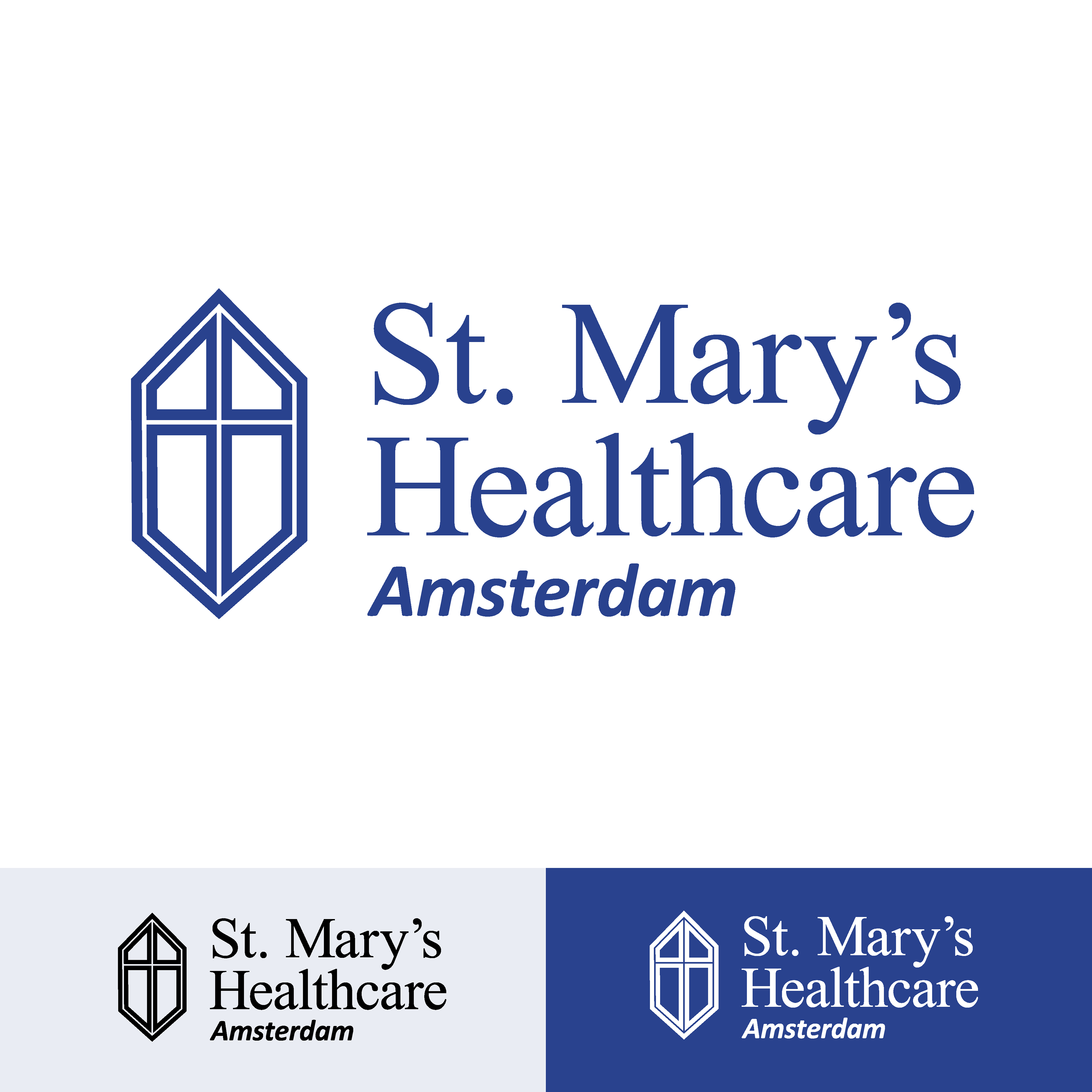
With this logo redesign, my main focus was updating the symbol that goes along with the type, as I think the current type design had little to improve. In my symbol, I used a 6-sided shape to represent the six core values St. Mary’s has as part of their mission, and a cross in the center to symbolize faith and religion. After I created this symbol, I also came to the realization that it closely resembles a section of the architecture of the main campus building.
With this logo redesign, my main focus was updating the symbol that goes along with the type, as I think the current type design had little to improve. In my symbol, I used a 6-sided shape to represent the six core values St. Mary’s has as part of their mission, and a cross in the center to symbolize faith and religion. After I created this symbol, I also came to the realization that it closely resembles a section of the architecture of the main campus building.
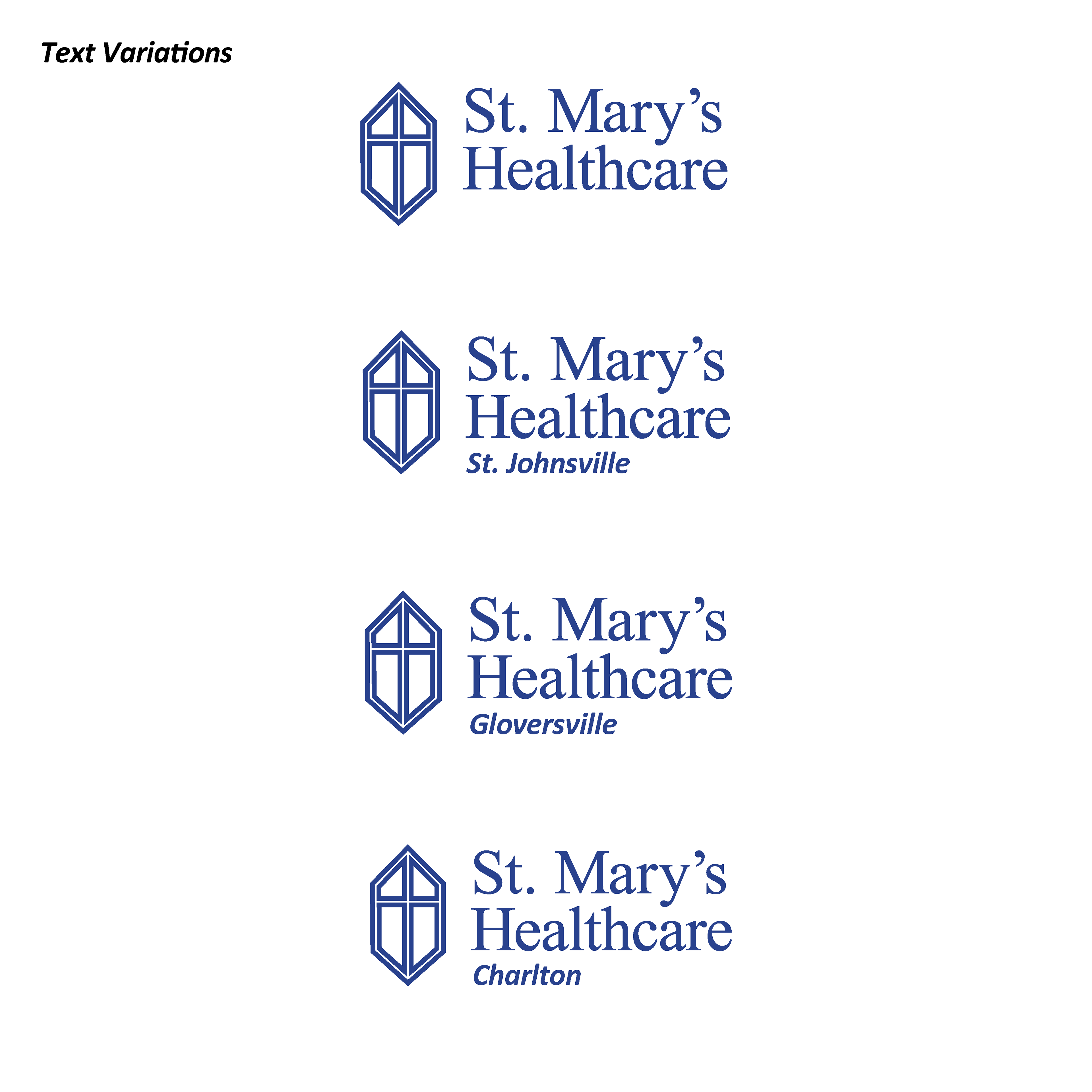
The three alternate locations listed here are for St. Mary's Urgent Care Centers

Photo credit to Martin Cherry via livability.com/ny/gloversville/health/health-care-providers-near-gloversville-ny